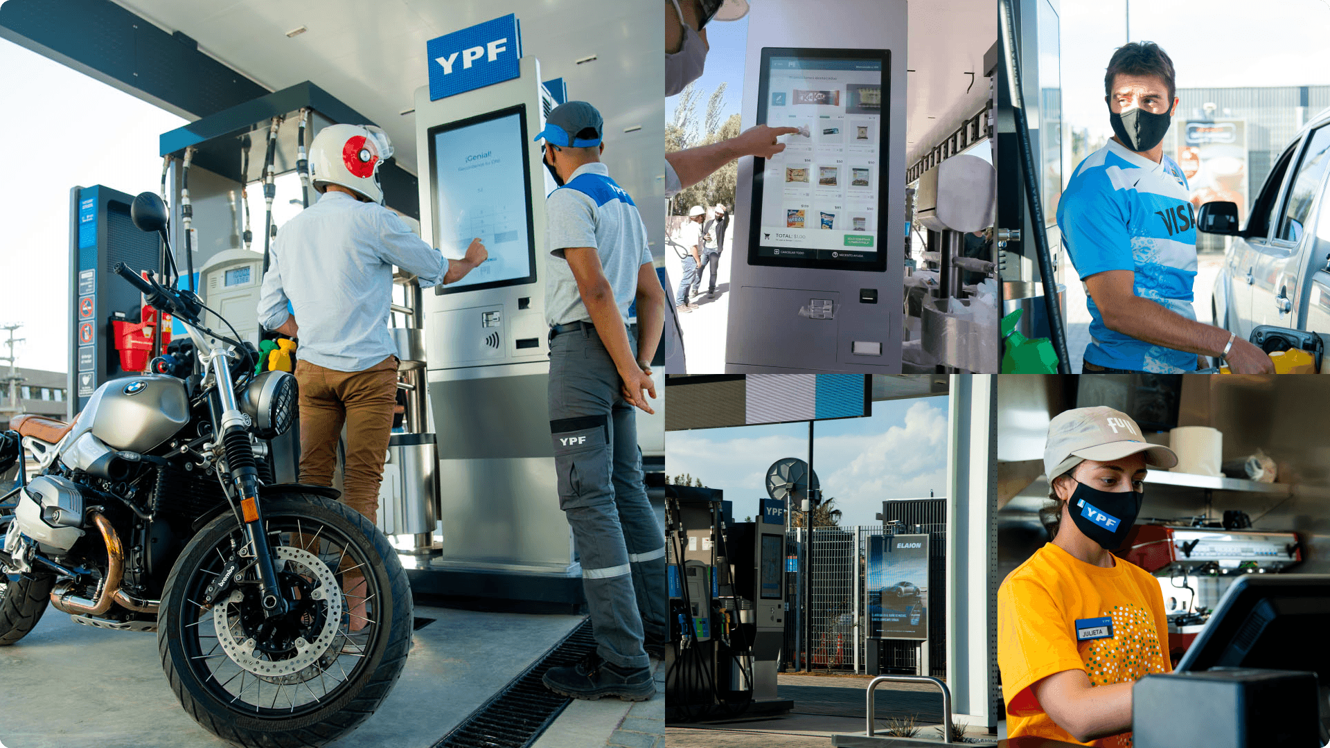
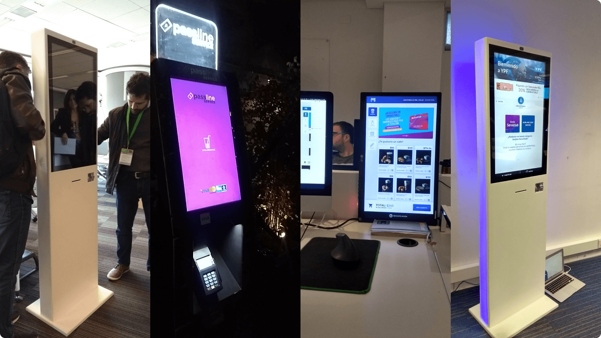
A collage of photos showcasing the first PoC self-service station in Lujan de Cuyo, Mendoza.
Teaser
As a Senior Product Designer at Edrans, I played a pivotal role in the YPF Maestro project, a transformative initiative to rebrand and digitalize YPF’s service stations.
This solution revolutionized YPF service stations, making them 100% AI-powered and introducing four innovative devices to enhance daily operations. This significantly improved customer experience and operational efficiency.
While I led the redesign of all four User Interfaces, this case study will focus on my unique contributions to the digital kiosk's UX/UI, which has already been released to the public.
Due to a strict NDA with AWS, I cannot discuss the other aspects.
History
YPF is a vertically integrated and state-owned Argentine energy company with over 100 years of experience in oil and gas exploration, production, transportation, refining, and marketing. With 1,500 petrol stations nationwide and 20,000 employees, YPF is a cornerstone of Argentina's energy sector.
For the YPF Maestro project, they partnered with industry leaders such as AWS, who entrusted Edrans with software engineering, cloud architecture, cybersecurity, and DevOps responsibilities.
I was the sole Product Designer on the Edrans team.
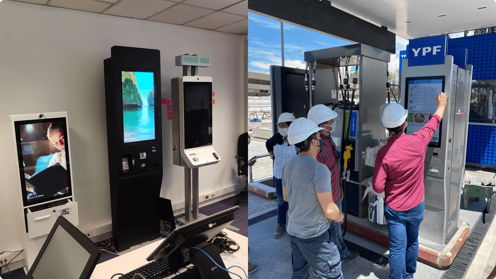
To the left. Three of the Digital Kiosk that where tested. To the right. 4 workers testing the implemented Digital Kiosk.
Problems
Customers often needed to wait 20 to 30 minutes for a simple fill-up, not including the time spent purchasing extras like coffee. This was due to the lack of self-service stations in Argentina, where customers rely on attendants, each managing multiple vehicles simultaneously.
To address this, we designed a Digital Kiosk to streamline the fill-up, cross-buying, and payment processes. In the background, AWS Sagemaker was implemented to create an AI model that personalizes marketing offers based on customer behavior.
Additionally, YPF employees tracked most operations on paper, leading to inefficiencies and potential off-the-books transactions.
Our solution aimed to automate these processes, improving transparency and efficiency.
My role
My primary responsibility was to redesign the Digital Kiosk's UX and UI. YPF had initially hired a design agency, but they delivered only partial solutions, covering mainly happy paths without completing all 46 user stories required for the MVP.
Upon joining, my manager tasked me with assessing the feasibility of the goal, defining the features to be delivered, and prioritizing which ones to defer to a backlog for future versions.
My technical expertise and ability to pitch ideas made me the ideal choice for this responsibility.
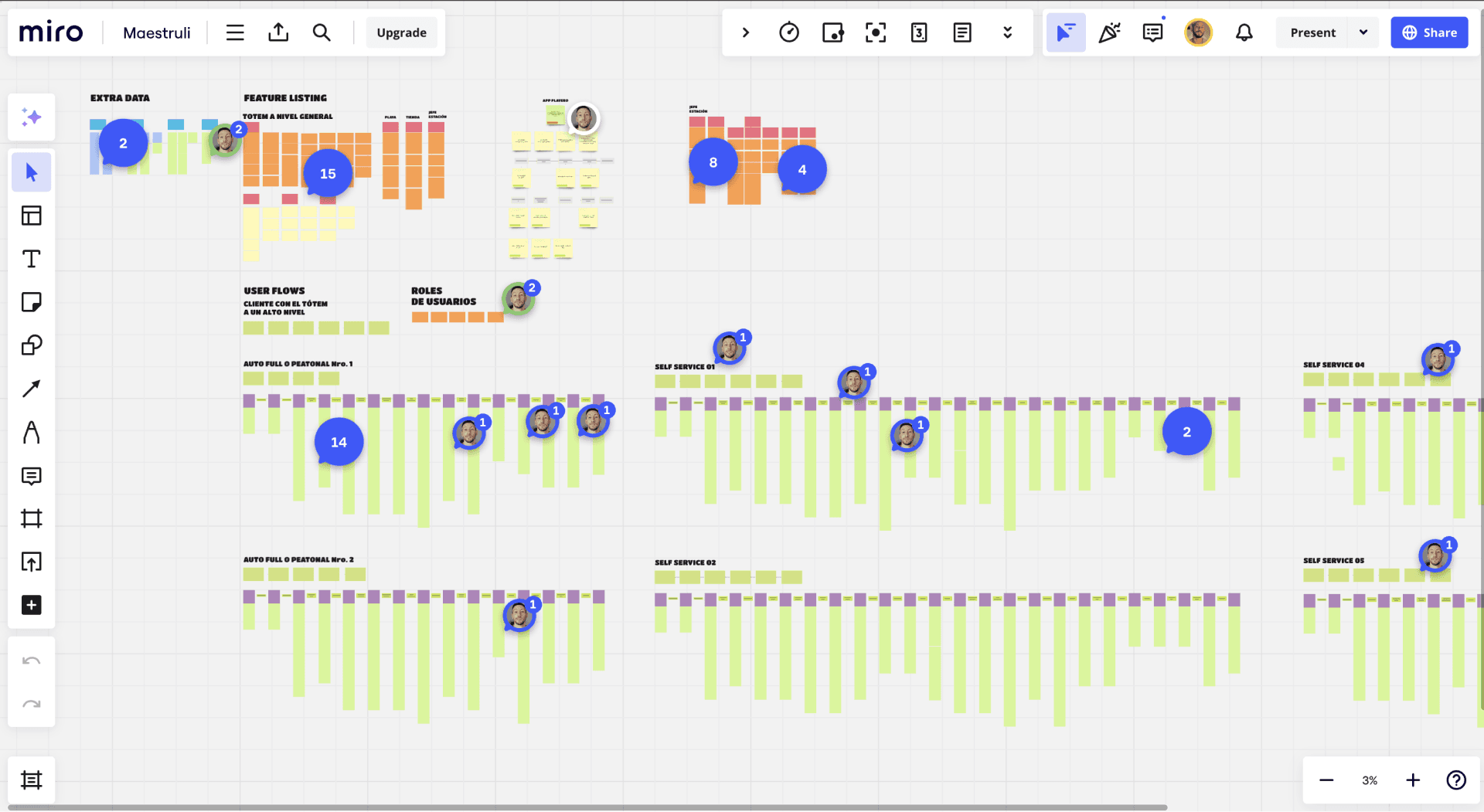
The original Miro canvas that we used to map all the User Flows and Journeys.
The Process
Upon receiving incomplete designs from the previous agency, I reverse-engineered the existing work, conducted a UI audit, and identified necessary modifications.
Given the project's complexity—spanning frontend, backend, APIs, and Cloud Architecture with stringent cybersecurity requirements—I created comprehensive customer journey maps, user flows, and feature lists.
We worked in Kanban with 5-day sprints, allowing us to adapt quickly and maintain momentum.
We received no formal qualitative or quantitative research but had access to field experts, so I worked closely with them to ensure our solutions were grounded in real-world needs.
I also conducted informal research on similar self-service and pick-up solutions, such as McDonald's digital kiosks, and drew inspiration from other industries.
This informed our design decisions, particularly when revising the e-commerce platform's UI.
For example, we replaced the initial carousel design with an infinite scroll and category sidebar, aligning the UI more closely with YPF's mobile app to create a familiar user experience.
Throughout the process, I regularly pitched ideas through rough drafts, simple prototypes in Adobe XD, and code deployed in a local environment. This iterative approach allowed us to refine the product in real-time based on stakeholder feedback.
4 stages of the Digital Kiosk UI and one example of my personal research.
Constraints
While implementing the payment flow, we encountered challenges with the number of steps required. We debated whether to hold a temporary amount on the user's credit card before or after the refill or to implement a physical barrier to prevent customers from leaving without paying.
Another challenge arose with the e-commerce platform's design. The initial proposal featured a horizontal scroll carousel without a search bar, requiring too many taps to reach desired items. Drawing inspiration from my research on McDonald's kiosks, I proposed replacing the carousel with an infinite scroll and adding a categories sidebar on the left.
While this approach was well-received by stakeholders, it raised concerns about the UI's look and feel, which needed to align with the futuristic rebrand vision. Anticipating this, I had already worked with the frontend team to develop a "theme" that mirrored the YPF mobile app's design. When the time came, we presented this theme, which was quickly approved for its familiarity and user-centric approach.
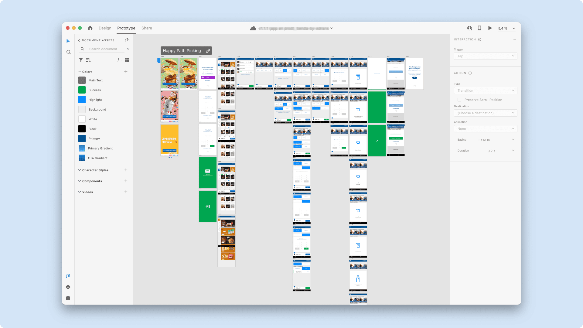
A bird-eye view of the final Adobe XD prototype that I presented as a solution.
Wrap up
The project was delivered on time and met all expectations, earning trust through proactive proposals and consistent delivery.
The kiosk reduced wait times by 90% and increased transparency in sales tracking. It was first implemented at a test station in Luján de Cuyo, Mendoza, chosen for its low foot traffic and high-comfort audience.
However, five years later, the self-service kiosk was only deployed at one more station in Buenos Aires Capital City, primarily due to union resistance, as the solution reduced the need for station attendants.

